Gone are the days when a story printed on paper and sent to your doorstep is enough to tell an impactful story to a large, diverse audience. It is my firm belief that digital, multimedia reporting (with all the interactive and engaging features and ability to spread to a more mass audience) is the direction that journalism is headed. However, with this newish “multimedia” approach to journalism comes the multimedia. And when you break that word down, it means one thing: more than one media. And that means more work.
So I won’t lie, the multimedia project I did last semester on NKU recycling was just that—hard work. But it was work well worth the extra effort.
The story went over well online and drew people in with its alluring narrative storytelling, interactive features and video clips. It also reached people from Alaska to Russia—something a Northerner story could never do in print.
The multimedia project as a whole ended up being chosen as one of the country’s top three nominees for a 2013-14 College Media Association Pinnacle Award for Best Multimedia News Story.
But with that success, comes the time to look back at what worked, what didn’t work, things to improve on, etc. Below are my takeaways from each element of the project.
Video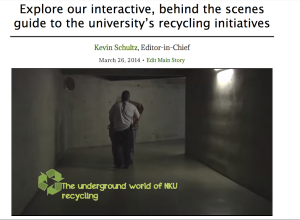
What’s the best way to visually illustrate NKU’s recycling process? Wake up at the crack of dawn and follow NKU’s material handlers deep into the university’s underground tunnels as they tackle the recycling process head on—at least that’s what we did. Was this really important breaking news? No. Was this the most exciting thing ever? No. But did the resulting video give an interesting glimpse into a place and routine that most people in the NKU community never get to see? Yes.
What I like most about our use of video in this project is the auto play feature at the splash page that draws viewers in, through offering them a quick look into a part of our campus they never get to see. I also like how we used video to visually illustrate the process of recycling at each part of the narrative telling of that step in the overall process. However, I definitely think we could work on getting interviews recorded and using the action shots as b-roll, not just playing elevator music and getting a better variety of shots.
However, I don’t think we did too bad for recording everything on a cold winter morning at 6 a.m. in the underground labyrinth at NKU.
Photos
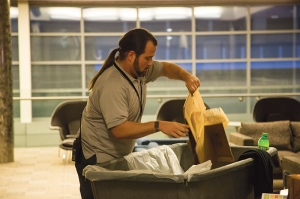 This part was a challenge. What is interesting photographically about trash? How about recycling? How can you make these items more visually appealing? What would people want to see in a story on this topic? These are all the questions we asked ourselves as we tried to get photography for this project. And while we didn’t end up getting as many shots or as interesting of shots as we would’ve liked, I was pleased with our idea of being able to visually illustrate the materials handlers walking own in the dark tunnels under campus to help the NKU community recycle their otherwise unthought-of trash. Lesson learned for next time? Brainstorm ideas and plan ahead!
Design
Who lays out a journalistic web project? Is it the front-end web developer? How about the graphic designer? What about the editor or reporter? Answer: a collaboration of all of the above. If nothing else, from this project we learned that no one person can solely be responsible for a website’s design. For this project, we left the design of the website up to the front end web developer and it led to a bit of confusion, both about the structure and function of the elements of the story.
However, what I learned from this experience was priceless. Now at The Northerner, we know how to plan ahead. We hold meetings at the beginning of the planning process for each project. At this time we run through rough ideas and the best way to present a story. Then we list items we’d like to feature. After giving the web developer time (a few days) to create a wire frame, all positions involved in the project (usually a lead reporter, editor, front-end web developer, photographer, designer and the digital project manager) meet to talk about the frame and make any needed tweaks. Then we create a checklist of what we need based on where they will be laid out, deadlines, the person responsible for that element, etc. This seems to be a much more systematic approach to the process and lends itself to less confusion or holes for things to fall through.
What I’ve learned about reporting for a multimedia story is pretty simple. Regardless of all the bells and whistles, what a multimedia story really needs at its core isn’t all too different from a regular story. It needs solid writing. Whether the story takes the form of hard news packed tight with facts and data or a narrative account with sensory details and characterization, storytelling is still what journalism is all about at the end of the day. In this package I tried to combine different types of storytelling. I used a news writing style to detail how NKU stacks up in regards to recycling versus the rest of the state/country. I used a more narrative style in describing the routine and hidden world of NKU recycling. I think the combination was good because it covered both sides to the story.
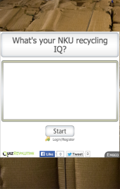 This was a challenge. I’m a journalist, so I thought creating a quiz would be easy; all I’d have to do is research the topic and find information to ask questions about said topic, then provide the answers. However, I was wrong. This part wasn’t so easy. Trying to find questions to ask that wouldn’t be too hard, but also wouldn’t be too boring was a challenge. Then there was the question of tone: should I sound like an expert or will that make me sound condescending? What I ended up with were clear questions that communicated most of the information I wanted too, but in a way that I personally think ended up being a bit too generalized or dumbed down.
Then comes the technical aspect. While one of our other front-end web developers said he could code a quiz to look however we wanted it to, I wasn’t working with him on this project. Plus, I wanted to use one of my digital tools to get practice. Therefore after looking through all of our options we decided to go with Quiz Revolution because it seemed the easiest to use for both the creator and audience. However, the design of the quiz tool wasn’t the best and it wasn’t quite as user friendly as we would’ve liked.
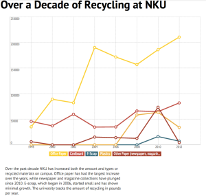 Dealing with data is always one of my favorite things. Call me a dork, but I love numbers and being able to use them in a story in a visually interesting and telling way. I read a book lately called “The Functional Art” by Alberto Cairo (recommended to me by a wonderful designer at Scientific American), which gave me a great overall insight into how to approach data visualization. Anyway, all this is to say that while collecting information regarding the amount of different materials that have been recycled at NKU since they started recycling efforts was a lot of work, I enjoyed doing it. It was a lot of work to go through all the sheets of information, but in the end resulted in an interesting and telling graph. This was also an opportunity to use an interactive data viz tool, which honestly has led to me using such tools more and more for my own Northerner stories and for others’. Lesson learned here: I think the tool we used work well and is a nice way to visually illustrate information to readers.
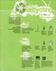 The infographic was fun to work on at first. However, I soon learned that to do a “by-the-numbers infographic,” I would need lots of numbers. I spent a long time using equivalency calculators and looking up reference sheets on some credible websites. I even had my friend (an economics and accounting major) double check my math to ensure proper accuracy. After spending hours getting all the math and information, I worked with a graphic designer to get things communicated visually. While I think there is room for improvement on the actual visualization of the information I was trying to communicate, I think things ended up looking nice overall. Lesson learned: to create a successful infographic, it takes a lot of work to come up with strong, robust and interesting information, as well as a clear understanding from your designer of what you are trying to communicate in the graphic itself.
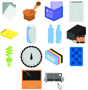 This is an element I haven’t seen in a lot of other publications, however I liked that we did this here. I wanted to create a list of recyclables, but I didn’t want it to be a boring, static list. Therefore, we came up with the idea of creating colorful icon representations of the items and having their descriptions pop up over each icon. I think this was a nice touch that served as an easy way to provide some audience interaction. I also like how the icons turned out overall, but they do look a tad bit childish. Lesson learned: the colorful, original design with interactive features adds a lot of interest to what could be a standard, boring list.
Overall I am really pleased with how the project came out and am excited to see how it fairs when the 2014 finalists for the College Media Association’s Pinnacle Awards are announced on Oct. 31.
